I finally migrated off of spotify, and all I got was this lousy
data dump of the CSVs of all my playlists. I ran this data analysis on my catchall “Liked” playlist – courtesy of Exportify. It’s actually really cool.
Come wit me on this journey of self-discovery…
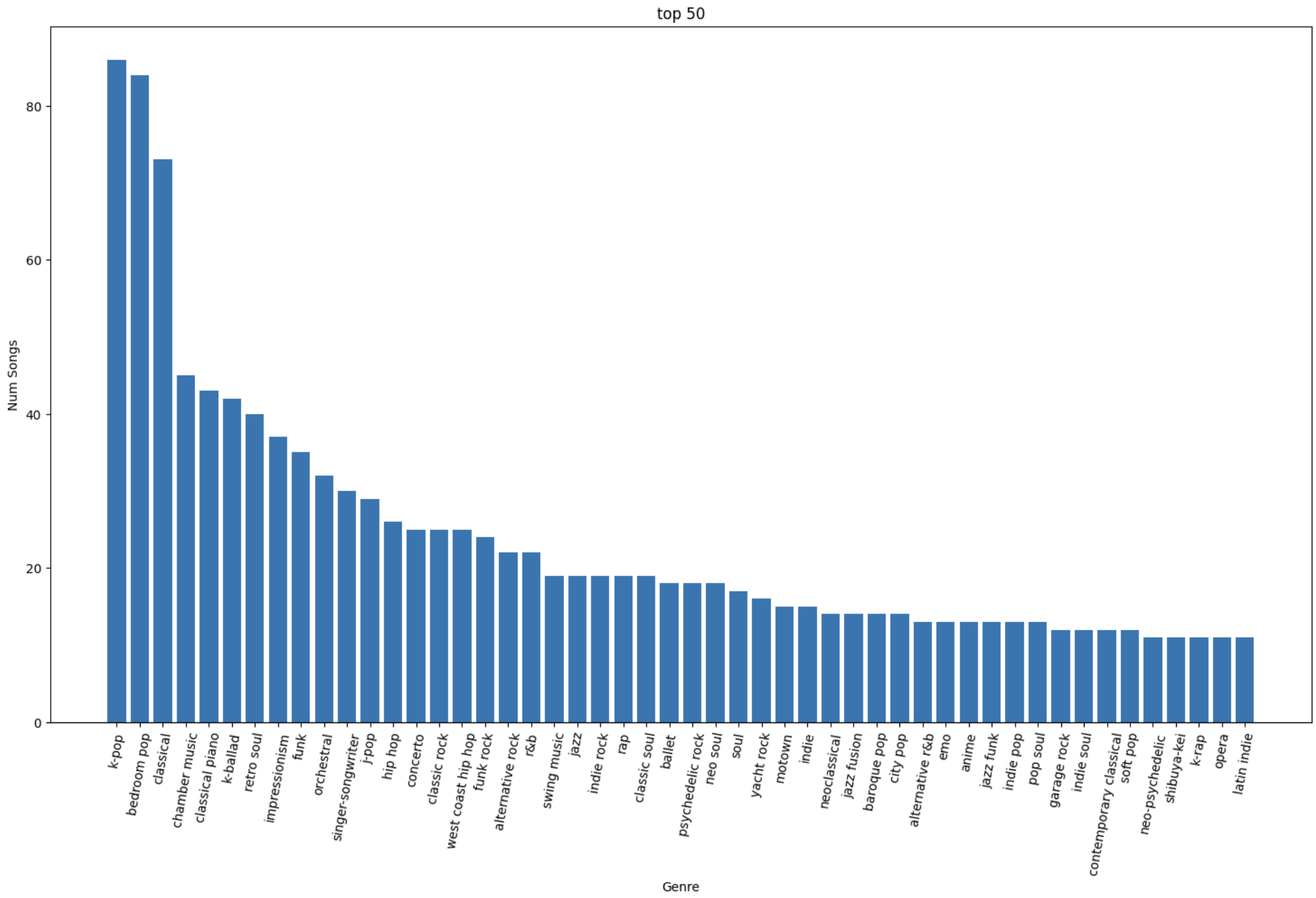
Top 50 genres by number of songs added
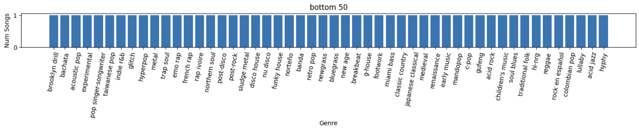
Bottom 50 genres by number of songs added
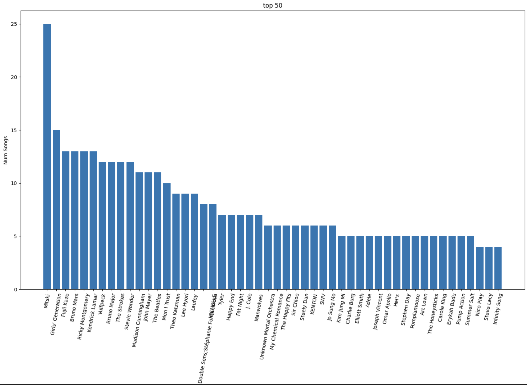
Top 50 artists by number of songs added
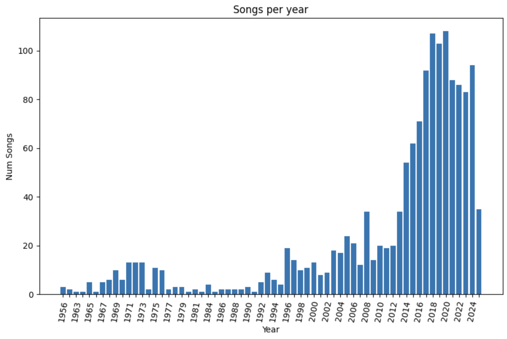
Number songs added by release year
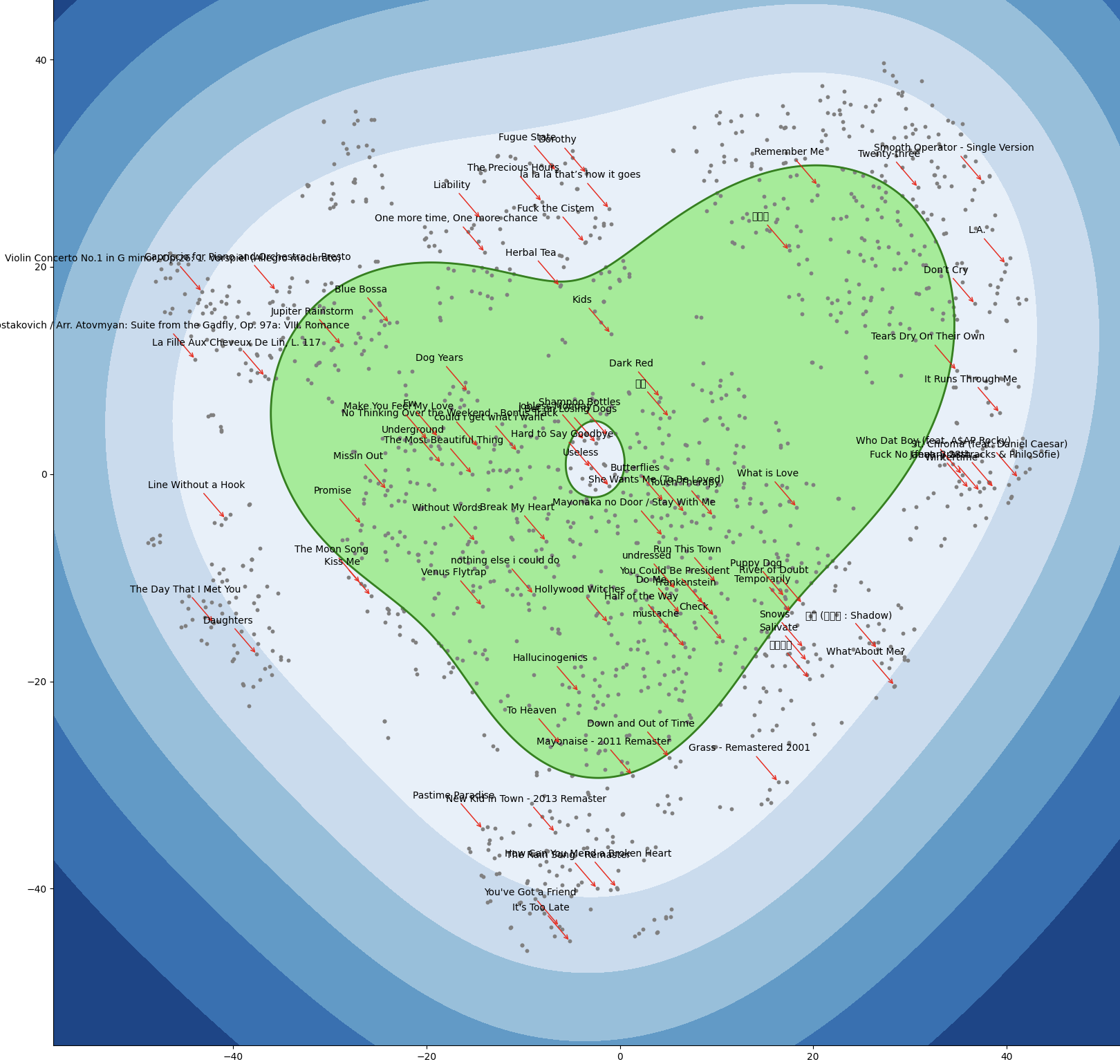
Decision Boundary of One-Class SVM in t-SNE space
The following graphs are made by feeding the dimension-reduced exported spotify data to a one-class SVM to get a sense of what the frontier of my normal taste looks like in that space, heat-map-of-the-universe-style.
t-SNE is a method for visualizing high-dimensional data in low-dimension. Songs which are more alike will be nearer each other in the feature space, but we can’t visualize a space with that many dimensions. What we can do is reconstitute the points in 2D, attempting to preserve the pairwise distances, the notions of similarity, between songs. Read this for more info!
using: [‘Release Date’, ‘Duration (ms)’, ‘Popularity’, ‘Danceability’, ‘Energy’, ‘Key’, ‘Loudness’, ‘Mode’, ‘Speechiness’, ‘Acousticness’, ‘Instrumentalness’, ‘Liveness’, ‘Valence’, ‘Tempo’, ‘Time Signature’]
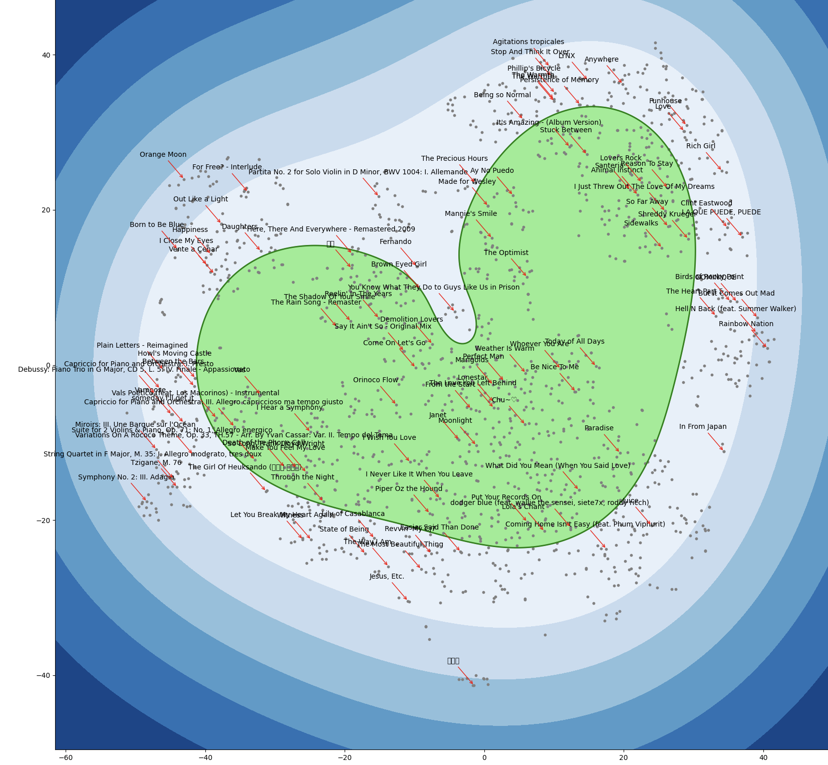
The point scatter looks really different every time this runs, because it’s stochastic. Here is another generation of the graph:
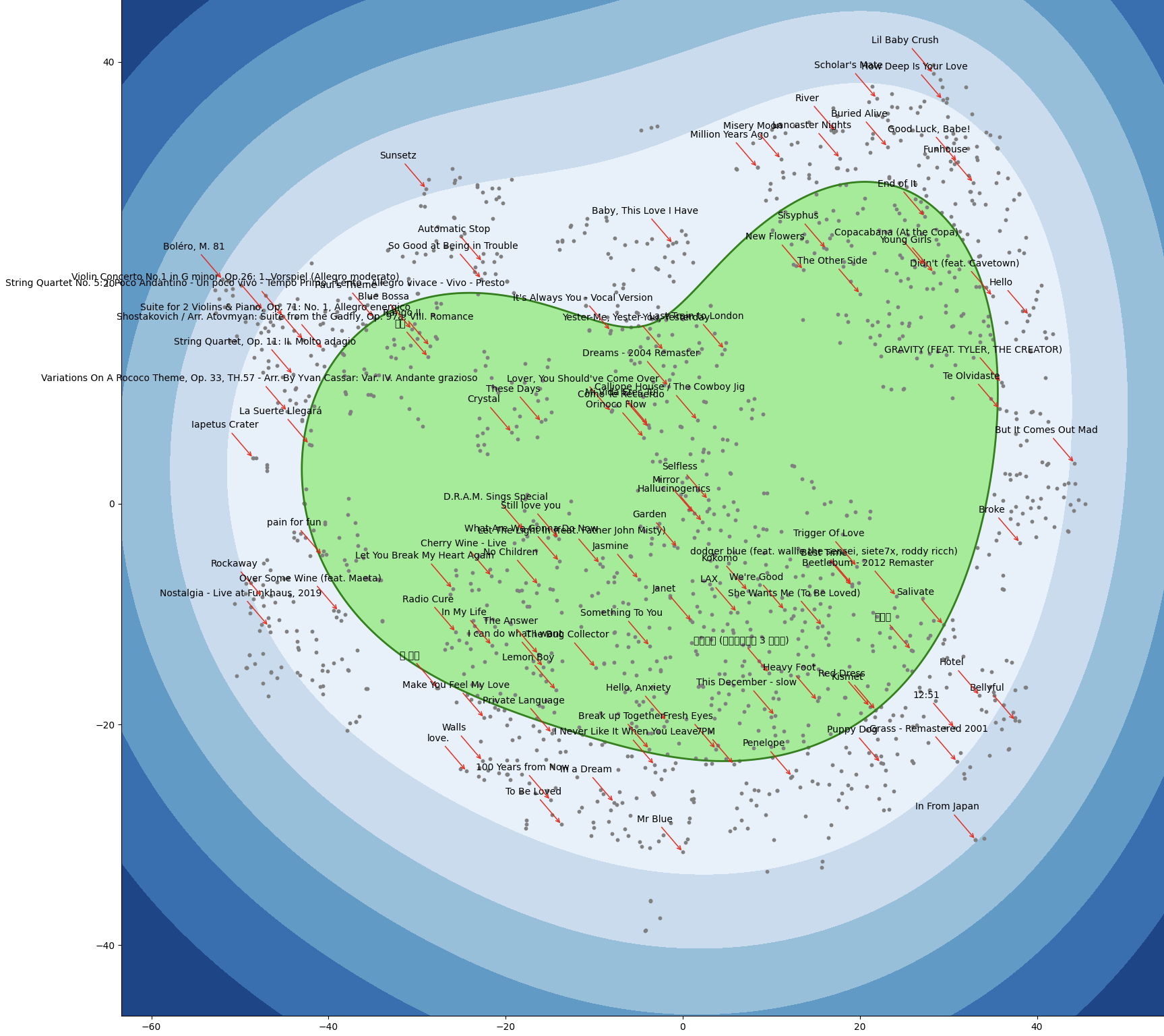
And one more generation here:
Goodbye forever, Spotify. It’s a shame you were Palantir-pilled.